In this tutorial, we will compare values with different color in one bar chart. You can implement it in matplotlib.

1.Import library
import matplotlib.pyplot as plt
import numpy as np
2.Prepare compared data
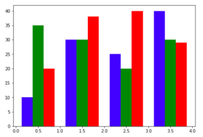
data = [[10,30,25,40],
[35,30,20,30],
[20,38,40,29]]
X = np.arange(4)
In this example code, we will compare three group data.
3.Create a bar chart to compare
fig = plt.figure()
ax = fig.add_axes([0,0,1,1])
ax.bar(X+0.25, data[0], color = 'b', width = 0.25)
ax.bar(X+0.50, data[1], color = 'g', width = 0.25)
ax.bar(X+0.75, data[2], color = 'r', width = 0.25)
4.Display bar chart
plt.show()
Run this code, you will see this compared chart: